PE ratios are one of the most common ways to value stocks. Although, good investors rarely use them. That’s when it comes to reviewing specific stocks. I’ll share some more useful investing metrics below.
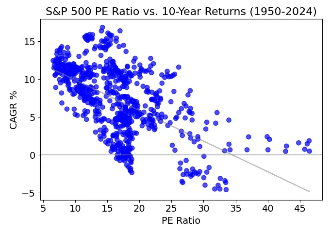
Instead, PE ratios give more signal with a top-down approach. They’re useful when looking at industry and market averages. For long-term investors, PE ratios can help predict stock returns. Here’s one of my favorite stock market charts…
PE Ratio vs. 10-Year Stock Returns

I compiled, cleaned and charted monthly data from 1950 to 2024. Since this compares the PE ratio to stock returns over the next 10 years, the most recent data points are 2014 PE ratios. I left out some outliers because I didn’t use cyclically adjusted PE ratios. Nonetheless, there’s still a visible trend.
The higher the PE ratio, the lower future returns. I also annualized the 10-year returns with the CAGR formula, a must-know for investors. This makes it easier to compare to other asset class returns.
For example, stocks have an average annual return of around 8%. That’s in line with the median PE ratio of 16 (where it’d meet the trendline). And this begs the question, where do we sit today? What’s the current PE ratio? How will stocks do in the next 10 years?
Stock Market Returns 2024-2034
At the time of writing this, the PE ratio comes in at 27 (you can check the current number here and the Shiller PE Ratio is even higher). Using the chart above, we can expect stocks to return roughly 4% average annual returns over the next 10 years.
When looking at risk-to-reward, that’s a hard pill to swallow. Even worse, real returns might come in close to 0%. The recent inflation rate is 3.5% and might hold for a while. This chips away at your purchasing power. Although, the long-term average is closer to 2%.
Average higher PE ratios help explain why Berkshire Hathaway has built up a $189 billion cash pile. Warren Buffett is struggling to find better investment opportunities. Given his fund’s size, he’s also limited to a smaller list of companies (huge companies). Putting a billion or even $10 billion in a company would barely move the needle.
Across many asset classes, we’ve seen lofty valuations. The Fed pushed rates to artificially low levels. And the risk-free rate is a key factor in discounting cash flows. But in recent years opportunity costs have changed.
With higher short-term rates, cash isn’t a complete drag. I’ve been getting 5.25% in my Robinhood account (on non-retirement funds). Short-term taxes are higher on interest compared to long-term capital gains, but even after-tax, cash is a much better opportunity today. The average S&P 500 dividend yield is below 1.5%. Although, there are plenty of high-yield dividend stocks hiding in the index.
How PE Ratio Predicts Stock Market Returns
The PE ratio vs. 10-year stock returns has predictive power. However, it comes with a few big caveats…
There’s a clear trend, but it has plenty of dispersion. Even with a PE ratio of 27 today, we might see anywhere from –5% to 8% average annual returns. Future returns could also land outside this range.
On top of that, averages can change over time. In statistics speak, these are regime or non-stationary changes. Over the decades, regulators and businesses have changed their accounting rules. There are also long-term economic cycles at play.
In recent years, higher rates have shocked many people. But for students of history, it’s recency bias at work. Even with recent increases, rates are still a far cry from the 1980s.
New Stock Market Averages?

This chart shows the same PE ratio and 10-year stock return data. Although, I’ve segmented it to show before and after 2000. As you can see, the patterns are different.
With this in view, recent decades have had an average higher PE ratio. Although, the returns have been higher as well (relative to the PE ratio). And this might be a slightly new normal. But I caution you, the four most dangerous words in investing… this time is different.
Beyond PE Ratios
To a man with a hammer, everything looks like a nail. When it comes to investing, make sure a hammer isn’t your only tool. It’s good to continue learning about businesses and the economy. You’ll start connecting more dots and can make better decisions.
You’ll find that history doesn’t repeat itself, but it often rhymes. Look at long-term averages and trends. The yield curve inversion is another one of my favorite investment charts. Also, when it comes to industries and specific stocks, here are more valuation multiples and metrics…
- Price to Sales
- Operating Margins
- EV-to-EBITDA
- Free Cash Flow
- Leverage Ratios
Comparing these to historical averages and similar companies is key as well. Going one step further, DCF modeling can help you understand and test different businesses outcomes. A few small assumptions can have a huge impact on estimated stock values.
For a simplified DCF model, check out my Gordon Growth Model Calculator. It can help you find the intrinsic value of dividend stocks. I included a YouTube video explainer as well. If you have any questions, please leave a comment. Or I always appreciate a simple “hello.” Where are you reading or watching from? It’s always cool to see, and this motivates me to share more research.